Symbolism and Ephemera: Exploring Usage of the Kulitan Script of the Philippines
I spent 4 years of my childhood living and studying in the Philippines. My mom’s side of the family is from Pampanga and I spent many summers and holidays visiting my grandparents and relatives there.
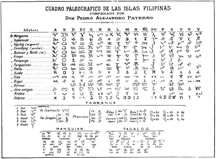
I remembered learning about the various languages and dialects around the country but I never learned about the different writing systems that also existed. It was only later in life and when I was living in the United States that I started to learn about the written scripts of the Philippines.1 My first exposure was to the Tagalog script, Baybayin, and eventually I came across Kapampángan’s Kulitan.
During my most recent visit, I asked my relatives if they knew about Kulitan, and I discovered that many of them had no idea Kapampángan had its own writing system. Kulitan, also known locally as Súlat Kapampángan and Pamagkulit, is the script of the Kapampángan language, part of the Austronesian language family. Kapampángan is spoken by over 2 million people in Central Luzon, Philippines. Kapampángan speakers reside in the provinces of Pampanga, Tarlac, and neighboring regions Bataan, Bulacan, and Nueva Ecija. It is one of the 8 major languages spoken in the country.

In 2017, Angeles City, the largest city in Pampanga, passed City Ordinance No. 424, S-2017, which established Kapampángan as an official language of the city and institutionalized its use in all sectors, alongside existing national and official languages. This local legislation had ripple effects and paved the way for cultural groups and language advocates to ramp up efforts to preserve and promote the use of Kapampángan language. One such effort is through spreading awareness about the Kulitan script, which makes the language more visible.
It is currently not taught in the standard regional curriculum, so knowledge of the script is primarily shared by dedicated artists and calligraphers through specialized workshops, most of which are offered for free to the public. This revival is further supported by active social media communities that use educational digital content to promote its use. Instagram accounts like Kapampángan Words, which to date has over 14,000 followers, posts Kapampángan words and etymology along with written Kulitan.
Digital apps also play a crucial role in its modern spread, with mobile applications such as Keith Liam Manaloto’s Learn Kulitan and the Holy Angel University Center for Kapampángan Studies’ KulitanApps providing accessible tools for new learners.


Research and Fieldwork
My proposal for the SEI Research Fellowship centered on the creation of digital fonts for Kulitan. I became fascinated by how the transition from a calligraphic tradition to digital typography might reshape individual character forms and stroke dynamics.
I set out to document modern examples of Kulitan, focusing my search on tangible physical artifacts and everyday ephemera. These examples would inform not only my own designs for a digital font, but also serve as attestations for a new revised Unicode proposal under development for Kulitan, authored by SEI’s Anshuman Pandey. In preparation for my fieldwork, the SEI team posed specific areas they were interested in learning more about: the stability of the orthography, the ways that community users were writing certain characters, and any examples of running text.
I became fascinated by how the transition from a calligraphic tradition to digital typography might reshape individual character forms and stroke dynamics.
My background is in graphic design and like many designers who use typography on a daily basis, I was intrigued by the idea of designing my own fonts. At the height of the 2020 pandemic lockdown, I learned how to write and read in Baybayin. Through online resources, I learned basic type design skills and began experimenting first with the Latin script and eventually with Baybayin.
When I started this project, I assumed that designing a font for Kulitan would be similar to Baybayin since they are both abugidas, meaning the basic units are consonants with an inherent vowel. However, as my research deepened, I discovered how complex this process would be. Although there are a few glyphs that are similar, the two scripts are very different.
Baybayin is written horizontally left-to-right with 3 basic vowels and 14 consonants. Dependent vowels are changed by adding a diacritical mark known locally as a kudlit on top or at the bottom of the character, and final vowel sounds can be cancelled by using a mark known as virama.2
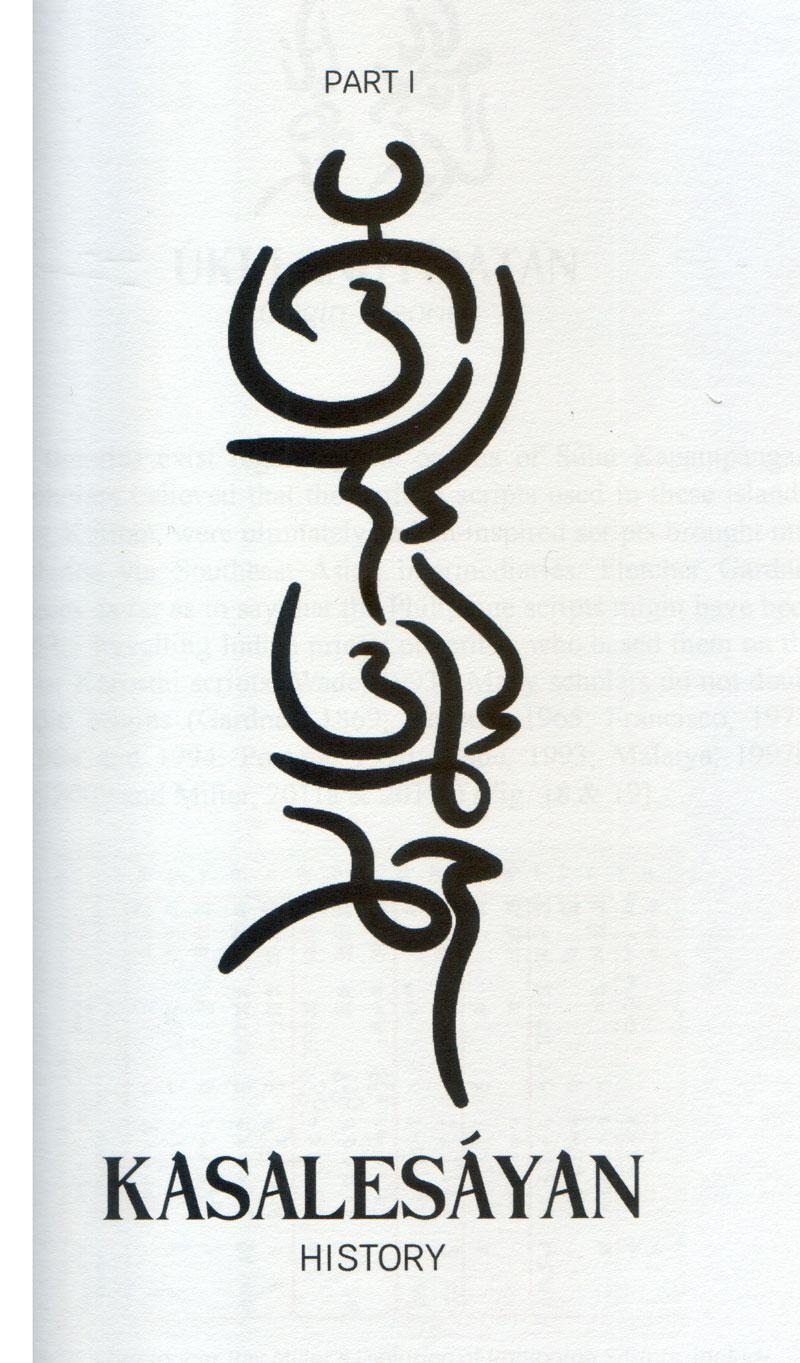
Kulitan, however, is written left-to-right in vertical columns with text running right-to-left.3 While Kulitan also has dependent vowels that are changed with a diacritical mark (known locally as a garlit) at the top or bottom of a character, cancelled vowel sounds, unlike Baybayin, are indicated by the placement of the glyph to the right of its preceding syllable instead of a virama mark.


Additionally, Kapampángan phonology makes distinctions between long and short vowel sounds, which can change the meaning of words. Kulitan conveys long vowel sounds through twin vowel glyphs. This particular feature of Kulitan was the most complicated for me to grasp. I learned Kapampángan as an adult, and although I can converse in it, I am not as proficient in writing Kapampángan using the Latin script’s diacritical marks. These marks are used to distinguish the different vowel sounds in Kapampángan and are very important in the workarounds used to design Kulitan fonts today.
I traveled to Pampanga in June 2026 for my fieldwork. Once I was in Pampanga, I was pleasantly surprised to find more examples of Kulitan than expected, especially around Angeles City. I believe that the 2017 city ordinance and the frequent workshops offered at the Sínúpan Singsing Center for Kapampángan Cultural Heritage played a part in Kulitan’s visibility today in the city.


I documented various uses of Kulitan in different contexts, such as street signage, murals, branding, and graphic design. Through conversations with artists and community members, I discovered how regional businesses used Kulitan to signal their pride in being locally owned. One café I visited had signage in both the Kapampángan and Filipino languages and had artwork with Kulitan lettering in the main dining area. The Kulitan lettering in the logo was on everything from decor, menus, coffee cups, to receipts. I took my coffee receipt back to the States with me and found that it had almost completely faded after a month of travel.
In my fieldwork, I was introduced to regional brands incorporating Kulitan into their products. The local lifestyle brand INDÛ sells graphic tees and stickers featuring Kapampángan expressions reimagined in a modern streetwear aesthetic. Rather than adhering to traditional calligraphy, many of their shirt designs use a modernized Kulitan style, adapting character shapes to align with the brand’s contemporary Y2K inspired visual identity.


During my visit, I also attended a workshop on Kulitan hosted by Mike Pangilinan, author of An Introduction to Kulitan the Indigenous Kapampángan Script at the Sínúpan Singsing Center for Kapampángan Cultural Heritage. Students ranging from late elementary school to college-aged packed into a classroom to learn about Kulitan. By the end of the workshop, each attendee could write and read in basic Kulitan. After the workshop, I had an opportunity to talk with Mike and Liam, developer of the Learn Kulitan app, to discuss efforts in digitizing the writing system and the challenges of doing so.
We discussed the state of Kulitan and how people are learning it. Mike estimated that he has taught around 6,000 people at these kinds of free workshops since 2008. While only a handful of these students have become expert writers, Mike said that most students are content knowing how to read and write their own names.
We also discussed the 2015 Kulitan Unicode proposal and how to potentially contribute to an updated proposal submission. They were surprised to find out I was searching for current examples of Kulitan — both mentioned thinking that the initial proposal had stalled due to a lack of historical evidence rather than modern examples of usage. Throughout my research fellowship, SEI provided me with additional context regarding Unicode submissions and the process each proposal goes through before inclusion into the Unicode Standard. With this background, I felt more comfortable talking through the various aspects of the Kulitan proposal which had previously felt mostly like technical jargon.
With this background, I felt more comfortable talking through the various aspects of the Kulitan proposal which had previously felt mostly like technical jargon.
I described the different encoding models being considered for the upcoming proposal: 1) an Indic model that Baybayin utilizes and 2) an alternative model similar to Hangul’s Jamo encoding. It clicked for Liam how the Jamo model could solve some of the syllable cluster and spacing issues in current Kulitan fonts. Admittedly, this is when I became most overwhelmed with my own font project and realized how complex Kulitan truly was. Mike seemed less concerned about which model was utilized so long as Kulitan could be displayed properly in vertical columns and not like a “Christmas tree.”


We also talked about how to represent loan words. Though there are some Kulitan users coming up with ways to combine glyphs in order to write non-Kapampángan words, for Mike, he preferred that these words be rendered in their respective scripts similar to how Japanese mixes different scripts.
I talked with Mike and Liam about my type design process of working from physical sketches, then digitizing each glyph, typesetting text to proof, and refining from there. Liam shared his process for making his font, Kulitan Handwriting. A software engineer by training, he programmed his font to dynamically render glyph substitutions and force spacing rules when displaying text in his app. He was surprised to see how different our processes were. At one point, I opened my Glyphs app to show him my font file and he was shocked to see how I drew glyphs individually. Liam showed me his computer screen which had a code editor up and a list of Kulitan character combinations that he had programmed. That moment convinced me that I needed to learn more code.
However, some glyphs in Liam’s Kulitan Handwriting font collide with one another in certain typesettings. Without additional spacing, diacritics marks can also be difficult to distinguish. But, this was not only limited to Liam’s font — I noticed these problems in my own font as well.
Reflection
On one of my last days in Pampanga, I caught a glimpse of a Kulitan character on a building. I circled back to the building, which looked like it was still under construction, and was able to photograph it. The metal cladding on the front of the building used Liam’s font. As one of the few available digital fonts, it is widely used and accepted among the community as a high quality Kulitan font and used in a variety of settings despite its limitations.

Without designated Unicode code points in place, modern Kulitan fonts must rely on “hacking” existing code blocks to work. Most often, you see fonts using code points from Unicode’s Latin block. Although these provide a good workaround, the fonts cannot easily render text properly without further manipulation in word processing and design software, as the Latin script works differently than a complex script like Kulitan.4
For the few digital apps that do exist, many of the technical workarounds require specialized knowledge in computer science, language, and design and involve investing significant resources just to make them functional. These limitations make it difficult to develop additional fonts as well as software that can use Kulitan. Further, these hacked fonts let you see or print the result you want, but can’t transmit text consistently across the internet because they aren’t using recognized standards.

As the Kulitan script moves from its calligraphic roots to digital spaces, it loses some of the unique ways it is rendered by hand. Kulitan’s beauty lies in how its letterforms are transformed when used in different words. Characters respond to the different shapes around them, creating a dynamic and lively visual language that becomes flatter when translated into a digital font.
Like in any other script, writing tools inform the shape of characters. For Kulitan, many writers use brushes or calligraphy pens. The texture and stroke contrast from this way of writing are also lost in the modern interpretations of Kulitan fonts. Commonly used digital drawing apps tend to have limited brush options, which can create rationalized characters with noticeable fixed-width strokes and artificial-looking stroke entries and endings. Vector editing software enhances this rationalized look to letterforms. Market demands are also influencing how Kulitan characters are modernized. To harmonize with their Latin script counterparts, I noticed a few examples of Kulitan moving from flowing curvilinear shapes to using more geometric characters to match branding standards.

Although I was able to document usage of Kulitan during my field work, many of the use cases were emblematic. I found no examples of printed, long-form running text, and the examples written in books were either transcribed or scans of images and not typeset. The workarounds needed to typeset long bodies of text make this task daunting. With few fonts available, locals are using and modifying these fonts in various applications and in very short, mostly symbolic ways. Moving forward, I plan to design more Kulitan fonts and develop a digital archive to document examples of the script in use.
As someone who is still learning type design, there are still many technical aspects about designing a Kulitan font that I still don’t fully understand, but I am grateful that my research fellowship has exposed me to the work that is involved in encoding a script. I’m inspired by the amount of people who are working to keep Kulitan alive.


| Julie Sayo is a Filipina-American graphic designer, educator, and Assistant Professor of Graphic Design at the University of Maryland, Baltimore County (UMBC). Her research examines heritage and identity in graphic design, with a focus on typography. She is currently developing typefaces for Baybayin, the precolonial Tagalog script. |

- Hanunoo, Tagbanwa, and Buhid are some of the encoded scripts of the Philippines. Eskaya, Kulitan, and the Ajami script Kirim are currently not encoded. Learn more about Philippine scripts here. ↩︎
- Baybayin uses a krus kudlit (+) as a vowel canceller while some users prefer an (x). More recently the Hanunóo pamudpod has become popular with type designers. ↩︎
- Interestingly, the flow of text for Kulitan has changed over time. See a talk by Anshuman Pandey on this topic here. ↩︎
- One early font designed by Norman de los Santos relied on rotating characters 90° clockwise to achieve the vertical writing direction. Read about it here. ↩︎